Release 0.6.1
Release 0.6.1 of Tessera is now available. This release brings a bunch of new features, refinement of existing features, and a ton of bug fixes and general improvements.
Flot is the default renderer
The flot renderer, which renders charts in the browser, using Javascript and the HTML5 canvas element, is now the default renderer. Flot provides interactive charts, and a much wider variety of presentation options than using Graphite’s built in static PNG rendering (which remains an option).
The nvd3 renderer, which was previously included for its stream graph support, has been retired. It remains available in the extras/ directory of the Github repository.
To set the Graphite static renderer as the default, set CHART_RENDERER='graphite' in your config.py. The old INTERACTIVE_CHARTS_DEFAULT setting is no longer used.
New Flot Features
The flot rendering engine has been enhanced with many new features.
Downsampling
This release incorporates the flot-downsample plugin, which implements Sveinn Steinarsson’s Largest-Triangle-Three-Buckets algorithm for reducing the number of datapoints in a time series graph while retaining visual fidelity. It reduces the number of points that have to be rendered when long time ranges are selected, which results in better browser performance. The sampling threshold is chosen adaptively based on the width of the graph.
Stream Graphs
NVd3 is no longer included in the core build, but d3js remains, as it provides convenient and comprehesive numeric formatting. Its stack layout is now being leveraged to improve the flot renderer – which brings stream graphs rendered to Canvas along with it.
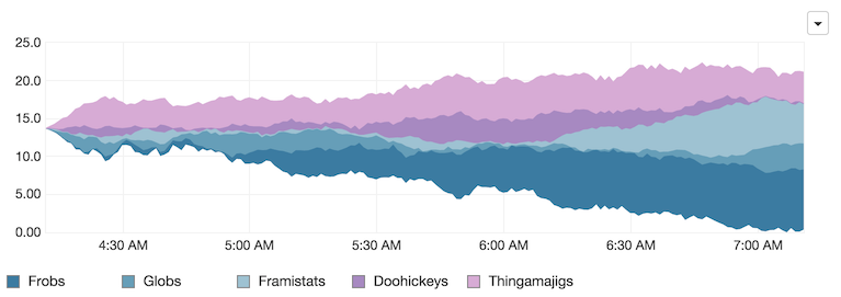
Percentage Stacking
In addition to stream graphs, stacked area charts can also be rendered in an expanded view, showing each series as a percentage of the total.

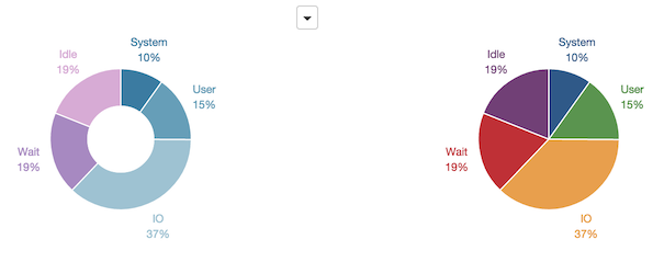
Donut & Pie Charts
In the previous release, donut (and pie) charts were always rendered by the nvd3 renderer (this was basically entirely out of laziness). With the nvd3 renderer being removed, the flot renderer has been updated to render donut and pie charts consistently with the rest of the charts it handles.
Max Value Display on simple_time_series

New Dashboard Items
Bar charts!
Bar charts are now available, in two varieties. Discrete bar charts, which display summation data (like pie charts do), are available in vertical and horizontal variations, with a variety of display options. Historical bar charts, which provide another visual option for time series data, are also available. They share most of their display options with stacked area charts.

And the rest
- The Handlebars JS template engine has been upgraded to release 2.0
- Sorting is now available as an option on all table presentations, and the rendering of the table sorting headers has been cleaned up so it’s no longer intrusive, and no longer causes layout changes in the table.
- The
sectionstructural dashboard item now has more options for rendering its header. - Auto-closing of the property sheet in edit mode can be disabled in the user preferences.
- The server-side python model object code has been made more flexible, so that it’s no longer necessary to modify the server side to add new attributes to existing model objects. Extending tessera with new attributes or dashboard items can be done entirely in the javascript code.
- Dashboard loading is much more efficient, due to not doing stupid stuff like loading queries multiple times, or queries that aren’t needed.
- Lots of bug fixes.
See the list of closed issues on github.